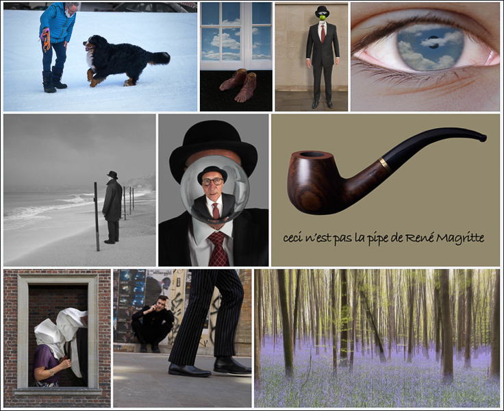
To see the above photos in more details, click on the image above, to read about them click below, and in both cases please follow me on the social medial links to the right.
Intro
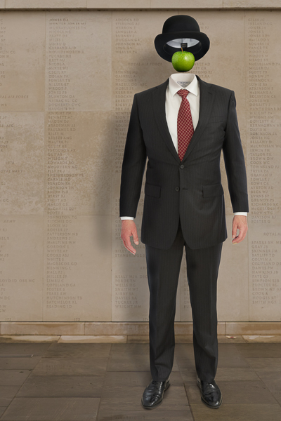
The last three months have been dominated by my obsession with recreating the works of Rene Magritte.
Structure of the post is as follows:
- Top Images
- Long Term Projects
- Progress against goals
- Notes
Top Images
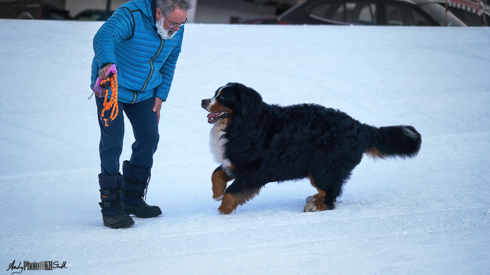
Gruzi the Bearnese mountain dog with his owner, Antonio. (Just before he jumped on me – 60kg. of playfullness).
Shot early morning on a skiing holiday in Corvara, on the 11th of March.
Very sadly Grutzi died later that month of a suspected heart attack. This was the last photo taken of him.
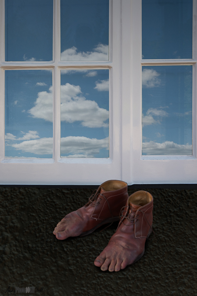
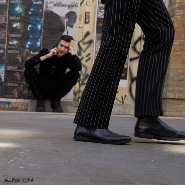
“Feet and Clouds”
Based on Magritte’s more rustic “Le Modèle rouge” which shows the feet merging with labourer’s boots on earth in front of a wooden fence.
My first attempt at this was in mono as blending of the pink of the feet with the brown of the boots was tricky and I had the wooden background. However, it was suggest that the image could be “more surrealist” if I changed the the “factual” background. Then it worked better in colour.
[Re-examining the Magritte original (version III), I notice coins, matches, a cigarette butt and a piece of rag on the ground by the boots. These, I think, add to the image both compositionally and contextually. Delightfully disturbing.]
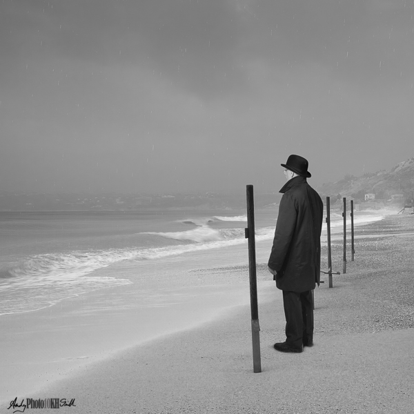
“Memories of Man III”
Composite of a stormy Kefalonia seascape, Magritte-style self-portrait shot in my kitchen, and a layer of artificial rain to enhance the original seascape.
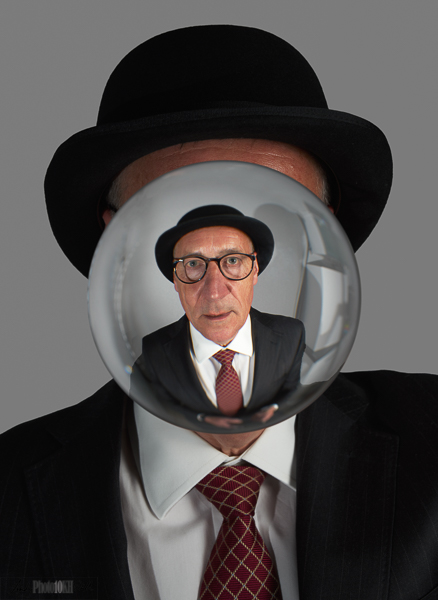
“Self Portrait with Lens Ball”
Shot in my kitchen with the lens ball given to me for Christmas. A composite to remove the stand of the lens ball, but otherwise a relatively straight shot.
Tried this image in mono. However, the red of the tie is an important feature of the image.
The glasses provide a frame within the lens ball which is itself a frame within a frame.
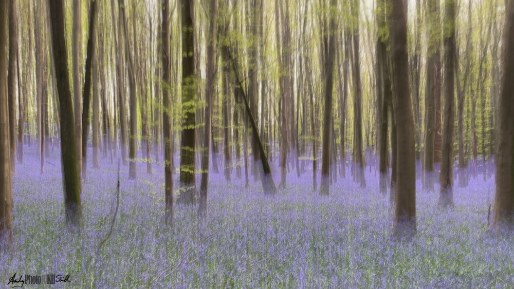
Long Term Projects
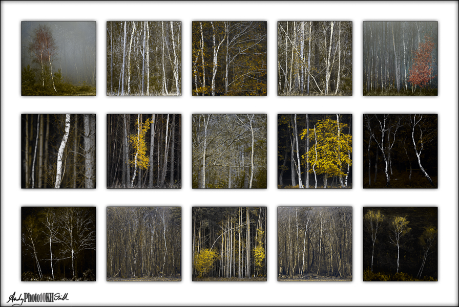
My potential RPS Associateship Panel has been revised in the light of the comments made by the Amersham PIC group as follows:
Progress against goals
I have reapplied for a CPAGB distinction and will submit the above A Panel as soon as the RPS opens some assessment slots.
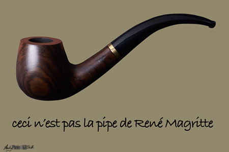
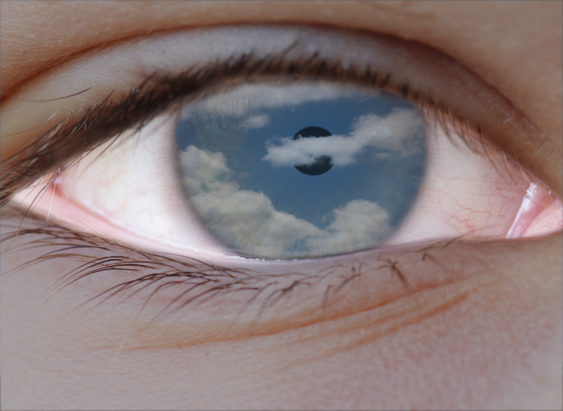
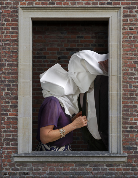
Loving the Magrittes – some excellent interpretations. I would say however that one overwhelming feeling (to me) from the original of ‘The Lovers’ is the feeling of suffocation from the close fitting bags on their heads – perhaps less a feature of your version. Also ‘Time Transfixed’ looks like fertile ground….?
On the A panel, and bearing in mind I am novice at the distinctions process, I think it is interesting and rather beautiful. I suggest however that the reddish colours (in particularly the top right) seem at odds with the rest of the panel a – blue or yellow image may suit better….?
Hi Kevin,
Thank you for your clearly well considered comments. I had not see the “suffocation” in the Magritte original, you are certainly right that the original are much darker, and my reinterpretations more frivolous. Magritte’s white hoods over the lovers’ heads is often thought to be a reference to his mother who was found with her nightshirt over her head following her suicide by drowning. That’s dark, and hard to match with Fran and me blindly groping about in our kitchen with pillowcases on our heads!
Point taken though and thank you for the observation.
“Time Transfixed” (train and fireplace), yes I agree. I’ve made a start, unfinished attempt made last month. Amongst other things I need a clock! See: https://www.photography10kh.com/journal-may22#May24
A Panel: red hues in images 1 & 5. Yes, it might be safer (and generally better) to tone these down or remove completely.
Thank you again for your thoughts.
Andy.