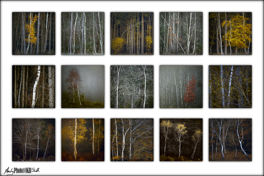
On 11th October 2023 I was awarded an Associateship of the Royal Photographic Society in Landscape Photography for the above panel. This post documents the nearly 3 year journey from early ideas in January 2021 and first creating a panel of 15 images, to being able to put ARPS after my name.
As usual, please submit thoughts and comments through the Comments box below. Thank you.
Structure of Post
This is a long story that I hope to make concise. There were plenty of mistakes; some absolute dead ends, others recoverable with help and advice from friends and mentors at my photography club or through the RPS itself. In all cases I learnt a lot and feel I have matured as a photographer. This post tells my story chronologically, documenting the challenges and changes in vision as they occurred.
- Requirements for an RPS Associateship in the Landscape Photography Genre
- First Idea
- Getting Too Clever with LAB Colour
- First Review by the Amersham PiC Group
- Second Review by the PiC Group
- First – Failed Submission
- One-2-One with Paul Mitchell
- Second – Successful Submission
- Thanks to Those That Have Helped Me
Requirements for an RPS Associateship in the Landscape Photography Genre
Quote from the RPS Website:
“The Associate distinction requires applicants to submit a body of work/project consisting of 15 images and a written Statement of Intent and a Presentation Layout. The images must be of a high standard.

Associate Criteria
- A Statement of Intent that defines the purpose of the work, identifying its aims and objectives
- A cohesive body of work that depicts and communicates the aims and objectives set out in the Statement of Intent
- A body of work that communicates an individual’s vision and understanding
- A high level of technical ability using techniques and photographic practices appropriate to the subject
- An appropriate and high level of understanding of craft and artistic presentation.”
Landscape Photography is defined as: “Photography that illustrates and interprets earth’s habitats, from the remotest wilderness to urban environs”
Additional distinction requirements and guidelines on the RPS Website.
First Idea
The Winter of 2020/21 was in the middle of the coronavirus lockdown and I had taken to early morning photo walks with my dog in Stoke Common. Whilst enjoying the crisp misty weather, I was also shocked by a programme to remove all the trees from the centre of the Common. At the time, I viewed as an act of environmental vandalism. Now, I realise it was essential to preserve the Common’s rare marshland.
But, this sparked an idea …

After discussing the idea of an RPS Associateship panel with my friend and mentor Yin Wong ARPS, we decided that I would: produce a mini-panel of 5 images for review by Yin, then Vic Attfield prior to presentation at the next PiC meeting perhaps with more images added.
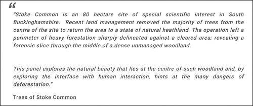
Above right is a draft Statement of Intent. At this point I was unclear which genre this panel suited: Documentary, Visual Art, Conceptual or Landscape.
Various telephone conversations with Vic Attfield resulted in the idea of having 3 layers, each representing different seasons in the Common and the panel as a whole telling the story of the impact of removing the trees with increased flooding, etc. I realise know that if this is what I had wanted, I should have changed the Statement of Intent to say that explicitly.
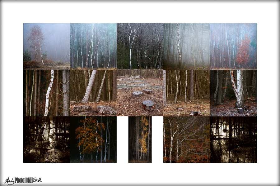
19th March 2021: Zoom with Yin Wong:
- “Making progress but not there yet”
- The panel needs to work better as a whole, with more consistent colour and tonality
- Image 3, too dark
- Images 11 & 15 (the black swamp pictures) are possibly too similar
- Ask Chris Palmer for advice prior to the PiC group.
Tips for an A Panel from Chris Palmer FRPS (member of the Landscape Distinctions assessment panel):
- “Make every image count”
- “We are told to assess to the criteria, it doesn’t matter if we like the images or not”
- “Usually the people who are not successful are those that haven’t sought advice.”
24th March 2021: Zoom with Chris Palmer who knows Stoke Common well and didn’t agree with my assertion that the removal of the trees was a bad thing. His comments were:
- “A long way from the required standard”,
- “in terms of colouration and tonality, the three tiers look as though they were created by three different photographers”
- ”some good images, some very weak (particularly 11 & 15)” [Vic Attfield, felt very strongly that images 11 & 15 were critical to “telling the story”. So I was initially reluctant to discard them.]
- “Statement of Intent, too long and doesn’t fit the needs of any category. What I have at the moment is probably best suited to Landscape, i.e., ‘photography that illustrates and interprets earth’s habitats’”
Getting Too Clever with LAB Colour
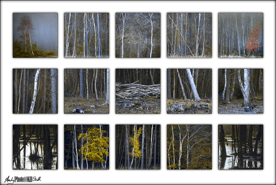
With the goal of trying to make the images more cohesive from a colour toning perspective, I embarked on an overly complicated, and almost certainly misguided, journey into using Photoshop’s LAB Colour Space to reduce the green-magenta colour dimension and amplifying the blue-yellow dimension. My idea was that this would reduce the seasonality of the images; spring pictures would look much the same as those taken in autumn, and the blue-yellow would enhance the perceived depth of the pictures.
To achieve consistency between the images, total neutrality, I developed the following technique in Photoshop:
- create a new stamp layer at the top of the layer stack – <shift><option.<command>E (for mac – or equivalent kets for PC)
- <Filter><Blur><Average> to create a single colour layer which is the infinitely blurred average of the image
- using the Colour Sampler Tool, click somewhere in the middle of this block of colour to add a reference point to the Info Panel
- add a curves layer and adjust the channels so that:
- Luminosity is consistent between layers
- A channel = 0 (neutral)
- B channel = 0 (neutral)
- deactivate the averaged layer, created in step 1 above to reveal the now perfectly toned and consistent image
This is a terrible idea.
First Review by the Amersham PiC Group
- Statement of Intent was too complicated and did not match the images
- The overall look of the images was just too blue (reasons above)
- Processing too crude and dominant
- Need a greater variety of focal length and camera angle
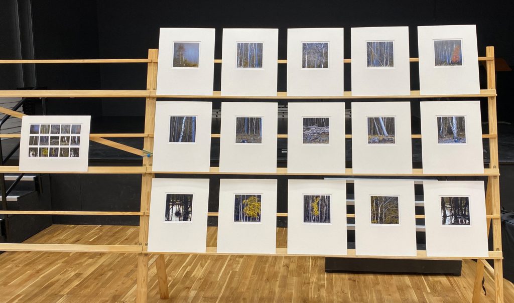
Summary: if reprocessed more sensitively, a third of the images were potentially up to the required standard, the rest were not.
The only good point was that it now looked as though it had been produced by a single photographer, albeit one that didn’t know much about post-processing.
Second Review by the PiC Group
Lots of work later …
16th December 2022, “better”:
- Statement of Intent, whilst much better, still needs a bit of tweaking to make it more about my input/ emotions rather than being purely factual
- Presentation good
- Tonal balance across the panel and more natural colouring, now OK.
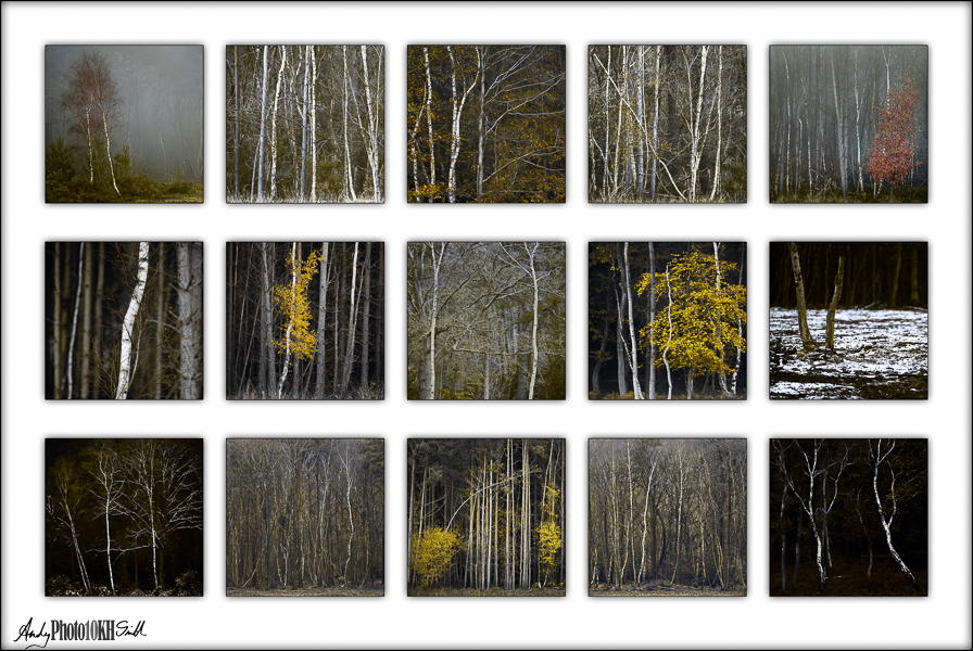
- images 1 & 5 need more punch or “lifting” to match the others
- the tree in image 5 should ideally have more space around it
- images 2, 4, 12 & 14 are too similar
- image 10 doesn’t fit – remove
- images 11 & 15 are too heavy, need “lifting” slightly so that they match the rest of the panel
First – Failed Submission
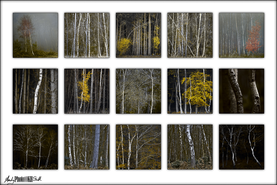
Feedback:
Reading the Statement of Intent, it is clear that you have a genuine affinity for this area, which is reflected in this very personal project, something we applaud in the Landscape Genre.
The submission was certainly seen as being calm and meditative and illustrates an individual vision and personal style. Submitting these as a sequence of square images also introduces a discipline that possibly an alternative format might not have offered. The balance and cohesion of the images was viewed positively; placing the darkest images in the bottom corners increases that sense of mystery.
However, technically:
- Colours notably lacked separation and looked ‘muddy’ in some images.
- Some images were perceived as being over sharpened and too contrasty.
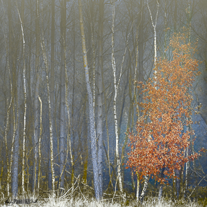
Joe Cornish took particular exception to image 5, left - Repetition of perspective and composition
- Some of the prints in the presentation were not flat and distractingly glossy. Perhaps the choice of a matt paper would have been preferable?
- In this instance the prints could have benefitted from being slightly larger
One-2-One with Paul Mitchell
19th July 2023: organised through the RPS, very useful session to ensure that I fully understand the criticism raised at assessment and what to do about it
Statement of intent:
- The program, to return the area back to heathland, is generally seen as a positive step ecologically speaking, so wouldn’t dwell too much on your adverse reaction to this – many landscape assessors are very sensitive to environmental issues
- Sense of calm when visiting this location and desire to capture the melancholy feeling through the use of a muted colour palette is worth noting in this statement
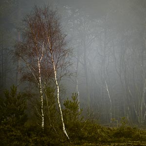
Image 1 is good and should set the standard for all the others.
This was relocated in the panel to give it greater prominence when displayed on the RPS stands where only the middle row is at head hight.
Advice was given about each individual image. The most common themes were:
- Make the colours look more natural
- Reduce contrast and be careful about over exposure
- Images which show signs of over-sharpening, being “too crunchy”, image 5 in particular, can be addressed with negative clarity in CameraRAW
- Replace the bad images – replacements were suggested from the “extras” that I provided (part of the normal one-2-one process)
- Consider swapping images 1&7 and 5&9 to give a more aesthetic layout. After amendments, image 5 was considered to be one of the stronger images. So this change meant that the strongest images were in the most prominent position head hight on the stand.
Second – Successful Submission
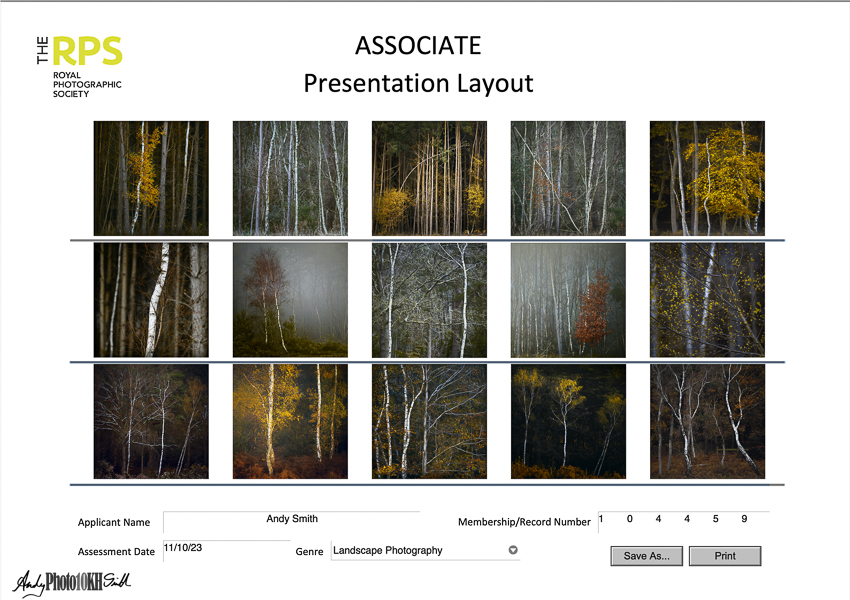
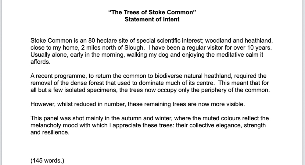
“It is clear that all the issues raised in the last assessment have been successfully addressed.”
Controversial Image
One panel member mentioned that he was not sure that he like the central image which he felt was slightly confused.
Two other members then immediately stated that they particularly liked that image.
[I particularly like this image.]
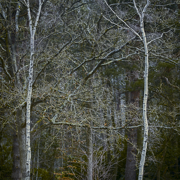
Particular praise: “The quality of images is beyond that usually seen at the Associate level.”
Minor criticism: images 11 & 14 are perhaps a little too dark, but this is a small point that can be overlooked.
Thanks to Those That Have Helped Me
Writing this post has made me realise the amount of help I have had achieving this distinction. Particular thanks to:
- Yin Wong ARPS
- Vic Attfield FRPS
- Chris Palmer FRPS
- All the members of the Amersham PiC Group
- Paul Mitchell FRPS
Inspiration, encouragement and practical advice and help.
Well done Andy – fantastic result
Thank you