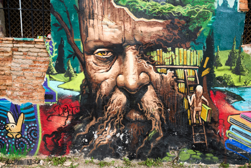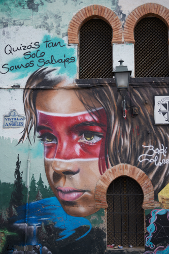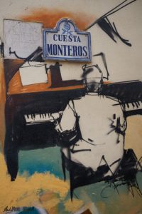
El Nino Graffiti in Granada Spain
If Al Hambra is the official No. 1 tourist attraction in Granada, the the Street Art Graffiti of El Nino and others is certainly the unofficial leader. It is impossible to miss. On our arrival in Granada, the taxi from the train station to the hotel took us past walls lining major roads entirely covered in the highest quality pieces. All of it, apparently, painted illegally; although many of the works are signed and the most prolific artist is the famous “El Nino de las Pinturas” (“the boy with the pictures”) or “El Nino” for short.
I hope anybody reading this blog post will enjoy the images, and if they subsequently find themselves in Grenada, will seek out these works rather than immediately joining the ranks of the 10s of thousands of others at the Al Hambra.
If you have any comments on this post, please post them below.
To see more posts on other photographic topics, or to follow my learning progress, please like or follow me on the social media channel of your choice to the right
Validity of this Post in a Blog on Learning the Art of Photography
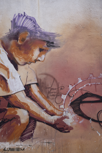
Given my definition of what counts as deliberate practice towards my 10,000 hours of learning the art of photography, I am comfortable that simply looking at an appreciating El Nino’s street art is a valid contribution towards my goal. However, when it comes to raising a camera, I am very conscious of the risk of merely photographing somebody else’s art.
 |
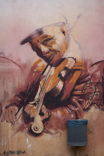 |
Surely, it would be hard to argue that the above are anything other than fine art. I love the waste bin by the violinists elbow; a moment of artistic appreciation brought gently back to earth..
What the Photographer Adds
To have validity in its own right, the photographer has to add something of themself to an image rather than merely creating a photographic record. In my opinion, this includes:
- Framing, including how much context, in the form of the surrounding street to include
- Controlling the lighting, both in the scene and post-processing
- Anything else added to the scene, e.g., people walking past.
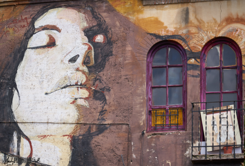
The following shows how framing decisions can completely change the message of the image.
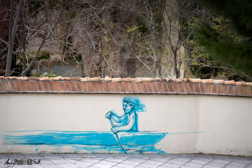
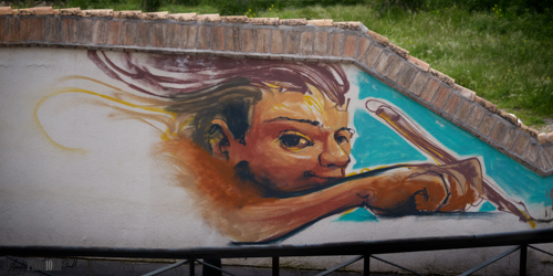
On a less profound note, the following just struck me as funny:
The Decision to Include or Exclude People
Giving a sense of scale and location:
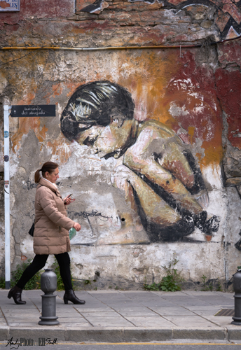 |
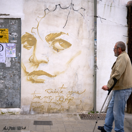 |
Removing Obstructions
Whist street names which are attached to the wall are often an integral part of a graffito, lamp-posts and traffic signs in front are an annoyance, and are (again in my opinion) best removed.
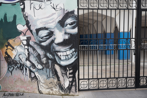 Most of the images on this page have had elements removed that detract from the image as a whole. |
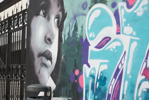
My Favourite
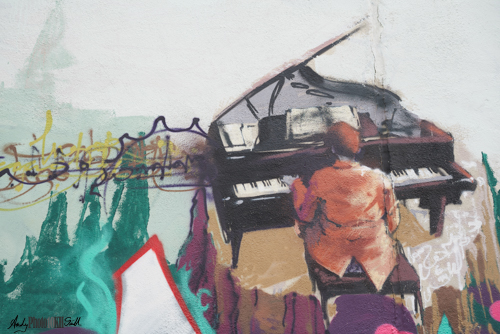
Click on any on the images in this post to see a higher resolution image on the Flickr site. Then scroll or otherwise access to all the other images in this album.
If you have any comments or questions about this post, please comment below. Or alternatively, connect with me through the social media channel of your choice right. In fact, please do that in any case!
