Diptych, Triptych, Polyptych
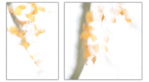
In the last year or so some of my most successful competition entries have been in the form of Diptych or Triptychs. This post is an attempt to consolidate my thoughts regarding what makes a successful Diptych (Triptych or other Polyptych).
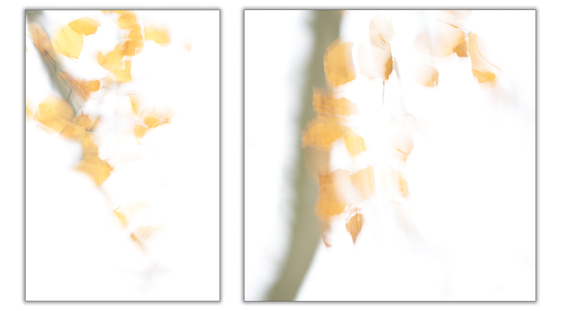
I define success as the whole being greater than the sum of the parts. For example the picture to the right, which was roundly applauded in competition at the Amersham Photographic Society, consists of two sub-images which on their own are OK but too simplistic to hold the viewer’s attention for long.
As usual, if you have any questions or comments, please post them below.
To see more posts on other photographic topics, or to follow my learning progress, please like or follow me on the social media channel of your choice to the right.
Whole Greater than the Sum of the Parts
When creating the diptych (triptych, polyptych) one is attempting to enhance the value of the image either:
- objectively or, i.e., to enhance the story being told, or
- aesthetically by combining the compositional elements that improve the combined image pictorially.
Or ideally both.
Enhancing the Story
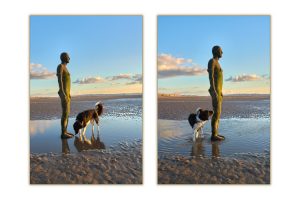
The following images are enhanced by being shown in pairs as the story becomes more obvious. In the image directly below, the success of the picture relies upon the dog’s confusion as to what it has encountered. This is more apparent when a pair of images is presented.
Compositional Enhancement
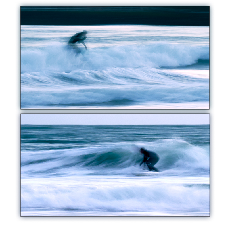
By combining the two surfer images below, the resultant picture has both dynamic symmetry and a more pleasing compositional structure. To see the latter point, consider first the top image in isolation. Here the image has two competing high contrast areas: the surfer and the breaking wave on the right edge, and the eye bounces uncomfortably between the two. Adding the lower image, introduces the second surfer, the third area of high contrast, and the eye is drawn naturally to these three elements in an aesthetically pleasing triangle.
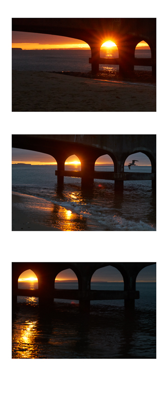
The triptych right shows a series of shots taken under Bournemouth Pier as the sun was rising. The story is enhances as the three images, from the bottom up, show the progression of time. However, the new compositional element that ties the elements together and adds impact to the combined picture is the series of suns and reflections that form a diagonal from the bottom left upwards.
Abstract
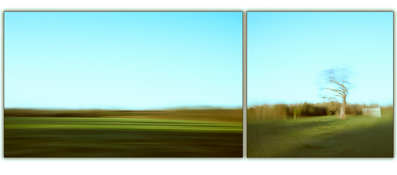
Techniques such as intentional camera movement or long exposures can simplify images to the point of semi-abstraction. The following diptych came third in the December 2018 Print Competition at the Amersham Photographic Society where it was applauded for its creativity.
As with both the ICM images that are combined to produce the following picture, the detail in each individual image has been reduced to a point where it’s overly simplistic.
Tying the Images Together
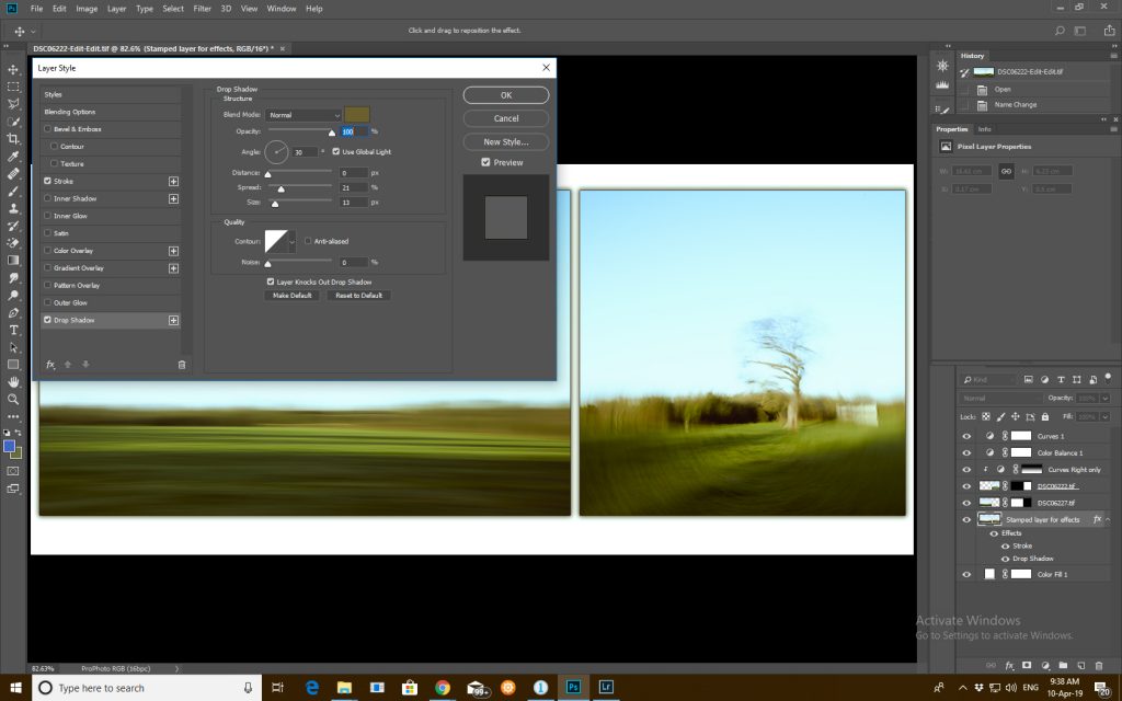
The following screenshot shows the photoshop layers used to create the revised version of the above diptych including:
- the clipped adjustment layer which improves the tonality of the right hand image to make it better match the one on the left
- the layer effects applied to the stamped combination of the two images.
Final Note
I hope the above piqued your interest and inspired you to try some of these techniques yourself. If you have any comments on the above, please post them below.
To see more posts on other photographic topics, or to follow my learning progress, please like or follow me on the social media channel of your choice to the right.
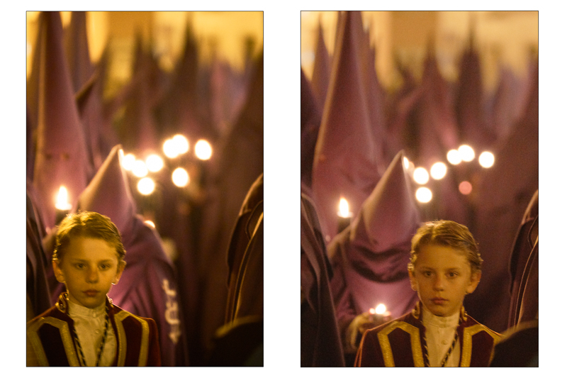
Why is there KKK photography here?
I guess you’re referring to the candlelight image of Semana Santa. This is a Catholic ritual carried out in various parts of in Southern Spain around Easter. I assure you, absolutely nothing to do with KKK.