Harmony in Colour
It seems that colours that look good together follow clearly defined rules.
Although colour theory and the associated psychology is a massive subject, the basic rules are fairly simple, and the simpler combinations are both easier to apply and seem to produce the best effects.
From a photography perspective, these rules can help:
- picking complementary colours for split-toning images in Lightroom
- using the Adobe Color Themes extensions in Photoshop for more subtle/ sophisticated treatments.
This is definitely a post that I expect to revisit in the future. So, if you have any ideas or thoughts, please post comments below.
To see more posts on other photographic topics, or to follow my learning progress, please like or follow me on the social media channel of your choice to the right.
Psychology of Colour
Aggressive vs Passive
OK, we naturally associate red with aggression and blue with being calm, but the reality is more subtle. In fact of the 4 psychological primaries:
- Red – Physical
People actually have a physical reaction to seeing red – this isn’t just a synonym for an attack of rage – red is stimulating, lively and very friendly but can also be perceived as aggressive and demanding. - Blue – Intellectual
The world’s favourite colour but can be perceived as cold, unemotional and unfriendly. - Yellow – Emotional
The body’s reaction to yellow is very tone dependent. The right tone will lift spirits and self-esteem, whereas the wrong tone will cause these to plummet, causing fear and anxiety. - Green – Balance
Right in the middle of the spectrum and in generous supply in a natural environment. It is a reassuring colour, but can indicate stagnation or being too bland.
Although not technically colours:
- Black – Total absorption of light
Seen as sophisticated and glamorous, but also oppressive and menacing - White – Total reflection of light
Denotes coldness and sterility, in both positive and negative senses. Interesting, like it’s absolute opposite black, can also be perceived as sophisticated.
Visually white gives a sense of spaciousness - Brown – muddled colours
Serious, reliable, supportive, earthy and boring.
For an expanded and more nuanced take on the above, see my source document: Psychological Properties of Colours
Warm vs Cold
A techno-pedantic and unhelpful observation:
- the warm colours (yellow through red) are those with the lower colour temperature (2700-3000K)
- and the cooler colours (blues, etc.) have a higher temperature (over 5000K)
- then Lightroom relates lower Kelvin values with cool colours, and higher values with warm ones
- hmmmm.
[Super pleased to find that it’s not just me, see Levi Sim‘s PhotoFocus post What’s up with Lightroom’s White Balance Tools.]
More Generally
It is so deeply ingrained in our psychology that it feels redundant to say that we associate blue colours with thinks that are cold, and orange-red colours with things that are warm. We do, but it is less obvious why.
Near vs Far
Studies have shown that people perceive red objects as being closer than blue objects. Items in the foreground tend to have more red (or warm colours) whereas items on the horizon appear more bluish or cold.

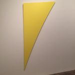
by Ellsworth Kelly 1996
Distortion of Shape
The painting to the right, which is simply a yellow triangle, really does look curved.
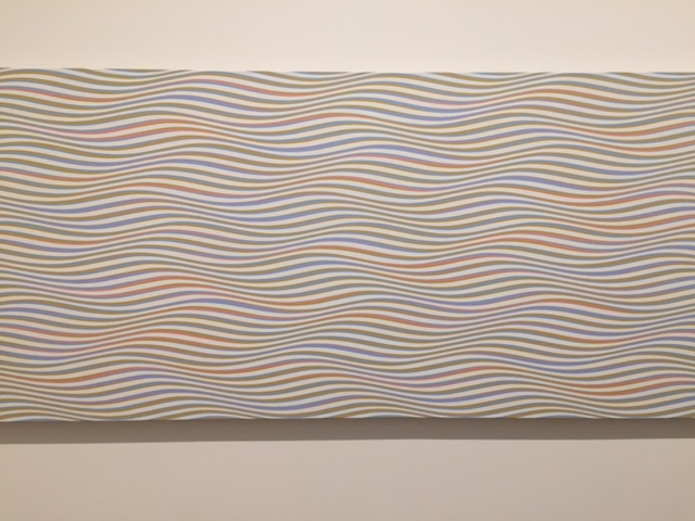
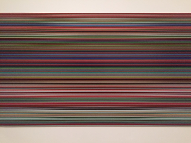
I was struck by this at a recent visit to the Tate Modern. Also the two paintings below which demonstrate the impact of adjacent colours.

Bridget Riley
Acrylic paint on canvas.

Strip (921-6) 2011
Digital print on paper between aluminium and acrylic
Mark Rothko
I previously thought of Rothko as the doyen of colour theorists. However, in the lecture: “Mark Rothko and the Inner World” his son, Christopher Rothko, suggests that form is actually more important than colour in his work.
Colour Harmonies
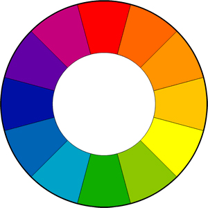
This is about creating schemes of colours from around the colour wheel that work well together. The key thing is to create a sense of balance or symmetry regardless of which scheme you are using:
- Complementary – opposite each other on the colour wheel
- Split complementary – opposite then a little bit apart on the wheel (lines joining them form an acute isosceles triangle
- Analogous – a group of similar colours (equal spaces between them)
- Triadic – three colours, like the three primaries equally spaced around the colour wheel so that the lines joining them form an equilateral triangle
- Tetradic – four colours, such that the lines joining them form a rectangle.
See: Basic Color Schemes by Tiger Color
Implementation in Post Processing
In Camera
I have started experimenting with dialling in explicit white balance (Kelvin values) in camera as suggested by Trevor Dayley (wedding photographer) in his FStoppers post: Learn to Shoot Proper White Balance Using Kelvin Temps.
The same post as mentioned above, What’s up with Lightroom’s White Balance Tools, has a great tip for shooting portraits with a orange gel over a flash at dusk and dialing down the White Balance in camera to compensate. This makes the background very mid-night blue, whilst the flash illuminated subject is perfectly exposed.
Lightroom: White Balance
This should be one of the first actions carried out in any post-processing workflow as it makes a huge difference.
When I first started shooting RAW, I used to shoot RAW + JPEG and use the automatically produced JPEG as my reference, so in post-processing I had a challenge for something to beat. This is a fun thing to do and shows how much impact white balance has on an image.
Lightroom: Color Toning
Color Toning is the forth panel in the Develop tab of Lightroom CC Classic, under Histogram, Basic and Tone Curve. It allows you to control the Hue, Saturation and Luminance of the 8 major colours in the image being managed.
I had never used this panel prior to starting my 10,000 hours. Now, still less than a 100 hours in, I’ve started experimenting with highlighting complementary colours.
Lightroom: Split-Toning
I have been experimenting with using this with complementary colours, e.g., Images of 20th November 2017.
Photoshop: Adobe Color Themes Extensions
This is something that at the time of writing is completely new to me.
